Composite Products
Composite Products can be used to create product kits and complex products by grouping existing simple or variable products.
Overview
Composite Products is an advanced product kitting toolkit for WooCommerce that allows you to:
- Create product kits consisting of multiple configurable components.
- Customize many aspects of their configuration flow, layout and appearance.
- Introduce dependencies between component options.
- Create multiple configuration paths by conditionally hiding entire components.
- Use discounts to make your kits more appealing.
The Composite product type is a great alternative to the Variable type, better suited for applications with complex pricing, shipping and inventory management requirements.
For an optimal customer experience in a wide range of kitting applications, the appearance of Composite products in the front-end is highly customizable. For large-scale kitting applications, the extension supports a step-by-step configuration process and a paginated, sortable and filterable view of component options.
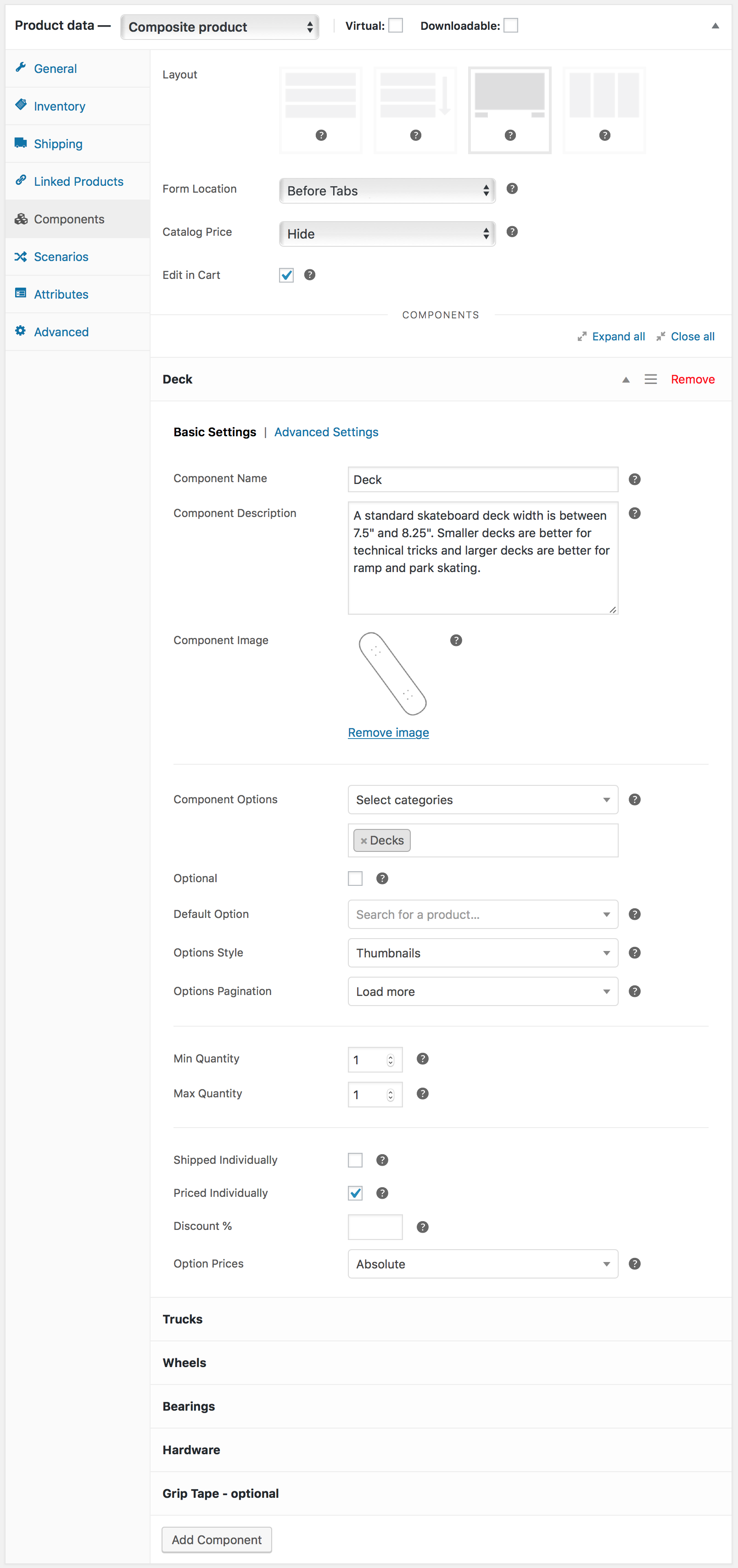
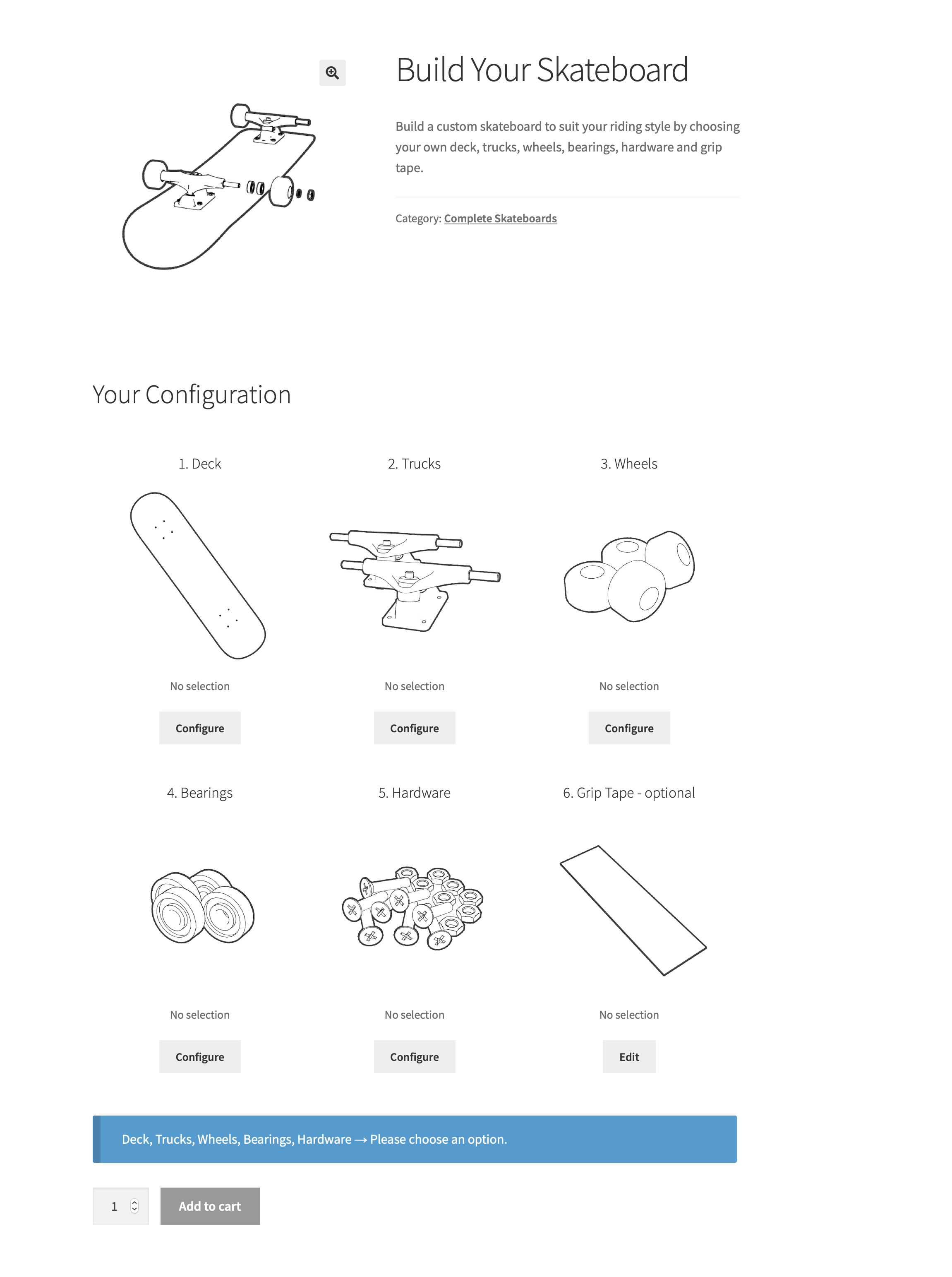
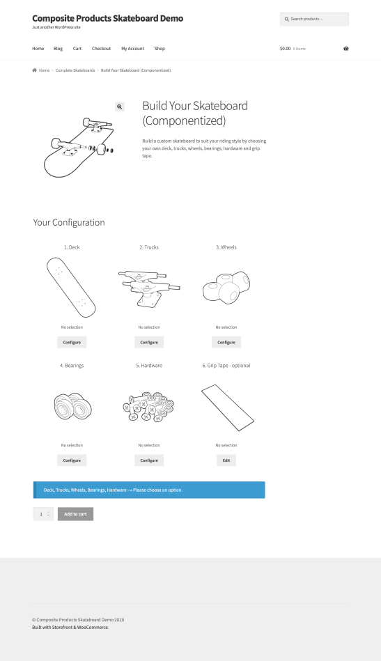
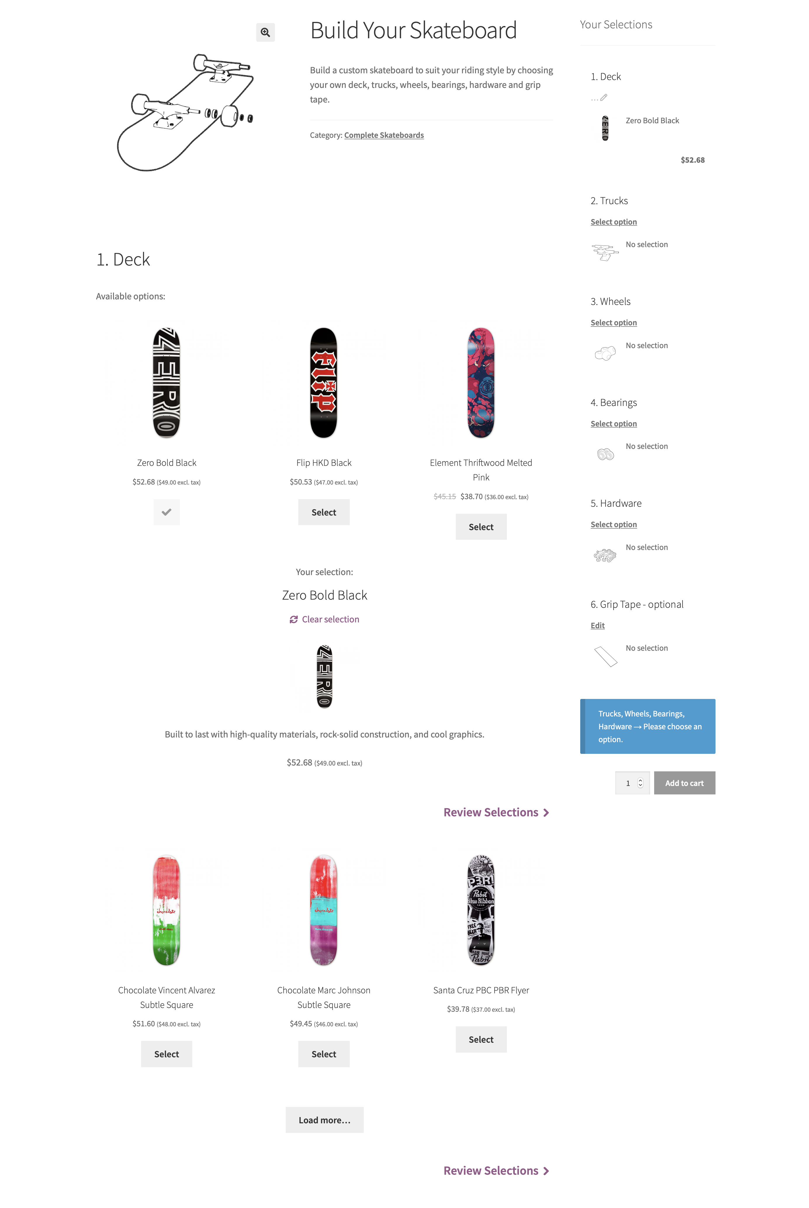
Every Composite product consists of multiple building blocks called Components. For instance, a complete skateboard is using:
- a deck (the actual board of the kit),
- a set of wheels,
- a set of trucks for mounting the wheels on the deck,
- a set of wheel bearings,
- some mounting hardware and
- optionally, some grip tape.
Each Component includes an assortment of different Component Options to choose from. Component Options are added to Components by choosing product categories, or searching for specific products.
Before you create a new Composite product, some basic preparation is usually required: Once you have decided upon a final list of Components, ensure that all products you need to use as Component Options exist. In our skateboard example, these would be all the individually stock-managed decks, trucks, wheels, bearings and hardware kits that will appear as skateboard options. You can freely add/remove Component Options later, but you will need to have at least a few products ready to start with.
When you are ready, follow these steps to create a new Composite product:
- Go to Products > Add New.
- Select the Composite Product type in the Product Data panel.
- Go to the Components tab.
- Click Add Component to add as many Components as needed.
- Assign a Name and Component Options to each Component — these fields are mandatory. To add Component Options, you can either choose the Select products option and then search for and add products one-by-one, or you can choose the Select categories option and then select at least one product category.
- Publish to save.
Component settings are organized in two sections: Basic Settings and Advanced Settings. Their configuration is documented in Component Settings.
- Composite products lack the advanced stock reporting functionalities provided by Product Bundles.
- Product Bundles have a content-aware database structure and API that makes it possible to run complex queries that involve bundled products – for instance, Product Bundles make it easy to get all the bundles that a product belongs to. This is not possible with Composite Products.
- Some advanced functionalities of Product Bundles such as the ability to exclude specific bundled product variations, override bundled product titles/descriptions, and control the visibility of bundled products in different templates are much harder to achieve with Composite Products, or may require writing custom code.
- The way Composite products look and behave in various WooCommerce templates is better suited for kitting applications. In general, Composite Products are agnostic to content in order to scale well – using Composites to create static bundles will yield a sub-optimal user experience in cases where content matters. For instance, a Composite cannot be added to the cart from the shop catalog without viewing the product details page, even when all Components are static and there’s nothing to configure.
To better understand the difference between these two extensions, compare the Complete Skateboard Bundle against the Build-Your-Own Skateboard Composite, and study the documentation of both extensions in detail.
Pricing
The Composite type can be used in a wide range of bundling/kitting applications with diverse pricing requirements, as it allows you to define a static composite price and/or add the individual prices of specific Components to a base composite price.
Static Pricing
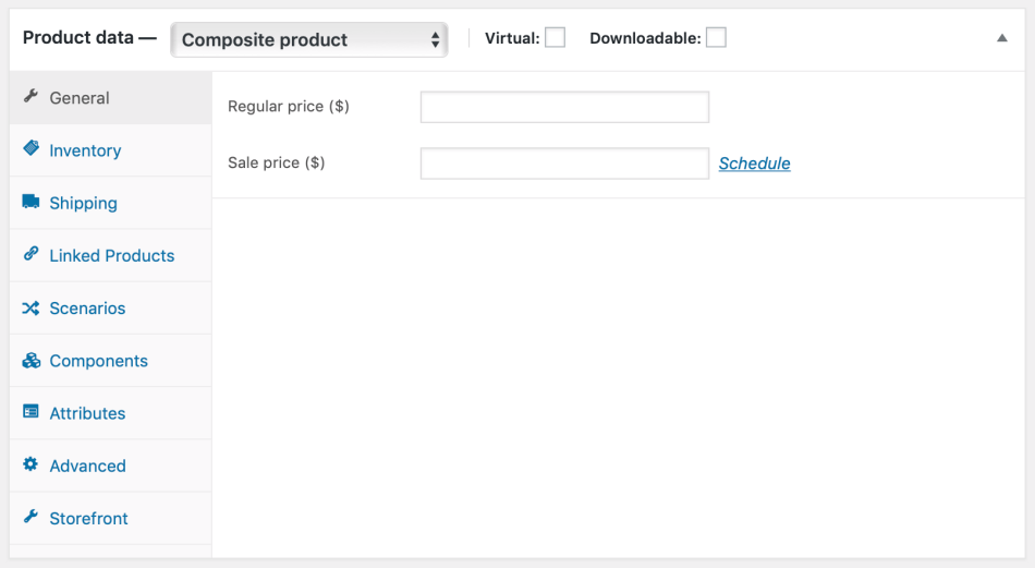
To assign a static price to a Composite product:
- Go to Products > All Products and select the Composite product you wish to edit.
- Select the General tab in the left menu.
- Enter a Regular Price and, if needed, a Sale Price. Note that if you only use these fields to define the price of a composite, its contents/configuration have no effect on its price. Despite its limitations, this simple pricing configuration is sufficient in some cases.
- Update.
Static Pricing vs. Reporting Accuracy
Changes to the Regular/Sale Price of a Composite product only affect the subtotal of its parent cart/order line item. When using this method to set the price of an entire Composite product, keep in mind that the order item subtotals of its components are zero — as a result, their sales reporting accuracy will be gradually compromised. If this is important to you, avoid static prices and only use them if a Composite product is a service, process or physical item with a “base value” of its own.
Static Pricing vs. Tax Law
In some cases, using a static composite price might not be possible due to Tax Law requirements. When creating a composite that includes product options with different tax rates, be aware that a static price limits you to a single tax rate.
Individual Component Pricing
In most kitting applications, the price of each Component needs to have an individual contribution to the total price, accounting for parameters such as the chosen product, variation (if applicable) and quantity in each Component.
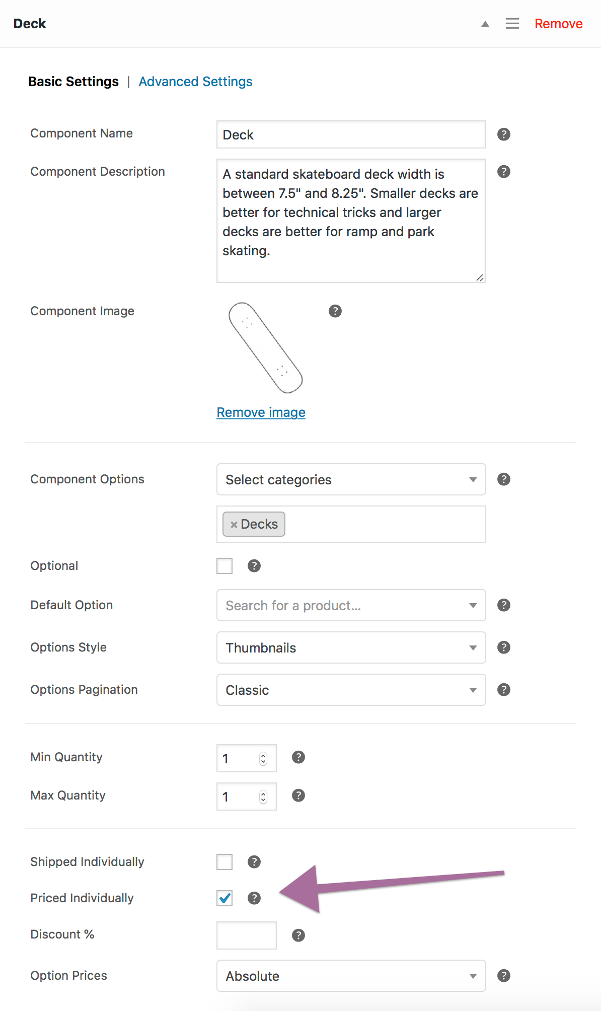
This is possible by checking the Priced Individually option, which is located under the Basic Settings tab of every Component.
When the Priced Individually option is checked, it is possible to define a Component % Discount. This is applied to the regular price of the selected product by default. Discounts provide an incentive for purchasing items in bulk and/or purchasing optional “add-ons”, such as accessories.
The example that follows demostrates how to create a configurable Composite product by grouping some T-Shirts and Hoodies in 2 Components. Both Components are priced individually and have a 20% Discount to help boost kit sales. Note that the Regular Price and Sale Price fields of the Composite product have been left empty.
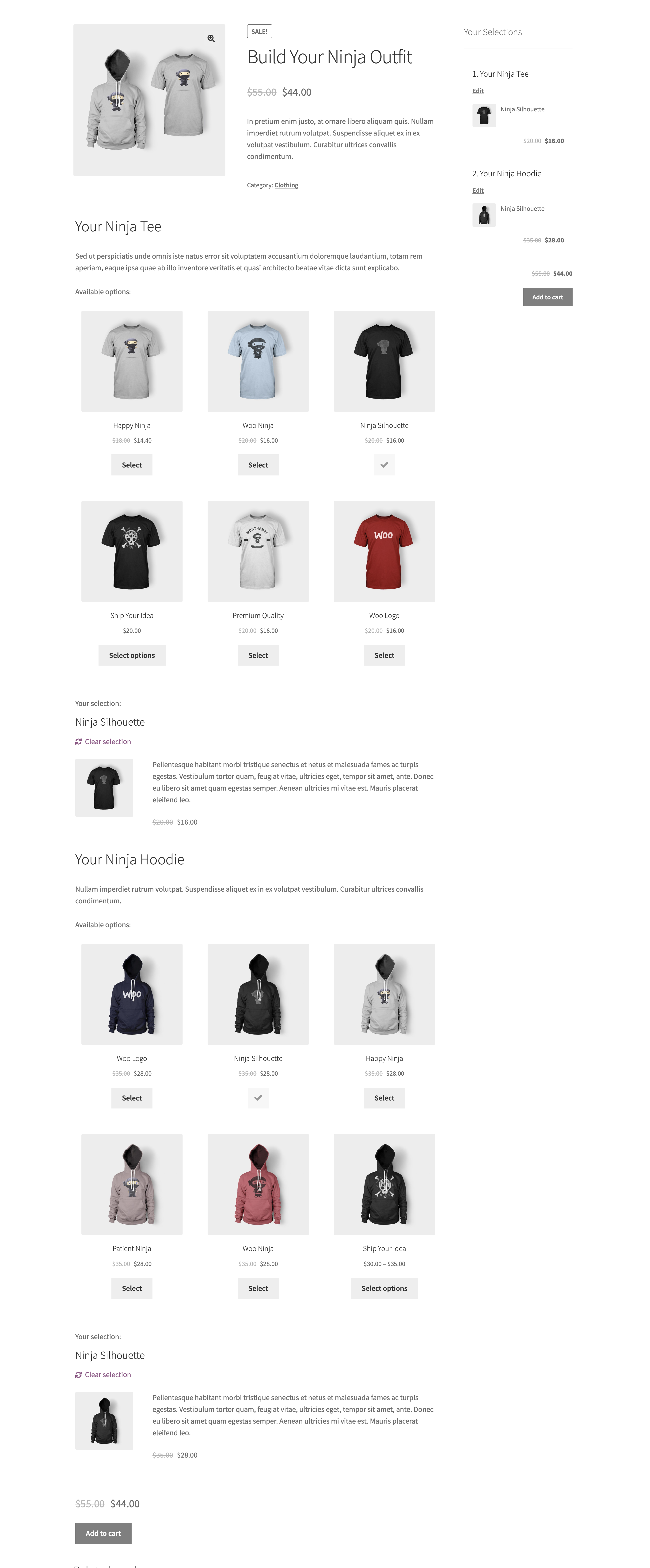
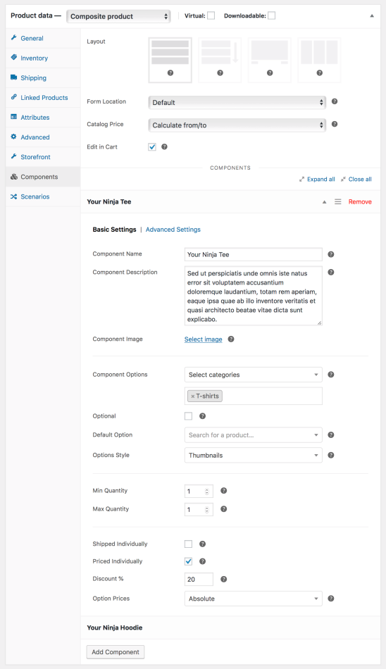
In cases similar to the Build Your Ninja Outfit composite, where at least one Component is priced individually, the Regular Price and Sale Price fields of the Composite product can be left empty. However, sometimes it might be desirable to define a static composite price and at the same time enable the Priced Individually option of one or more Components. In this case, the defined composite price should be thought of as a base price, since it is always contributing a fixed amount to the total of the composite, regardless of its configuration.
Negative Component Prices
The prices of all products contained in individually-priced Components must be positive.
Individual Pricing and Cart/Order Totals
By default, the cart/order item subtotal of a composite parent item is calculated as the sum of: i) the base/static composite price subtotal and ii) the subtotals of all individually-priced Components. At the same time, the subtotals of individually-priced Components are displayed with an Option subtotal: prefix. To prevent this, download and activate this plugin.
Shipping
Introduction
From a shipping perspective, WooCommerce products are classified as:
- Virtual — services or digital items that do not require shipping.
- Physical (non-virtual) — products with a weight and dimensions that need to be shipped or picked up.
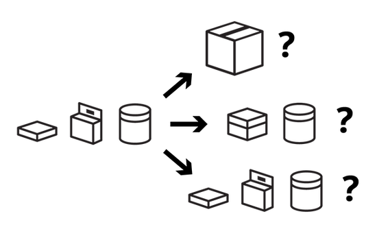
Composite products typically consist of multiple virtual and/or physical products. However, the physical properties (weight & dimensions) of a Composite that’s packed and ready to be shipped are not always identical to the physical properties of its components. This is very common in bundling/kitting applications that involve a physical assembly or packaging process. Consider this example:
From a shipping perspective, physical bundles/kits can be classified as assembled and unassembled ones:
- Assembled kits have their own physical properties which replace the physical properties of their components.
- Unassembled kits are physically identical to the sum of their components.
The extension supports both types. It even allows you to create partially assembledComposite products by individually selecting Components that require assembly, and having the rest shipped individually.
Configuration
To configure a Composite product for shipping, follow these steps:
- Determine if the Composite is a Virtual one. Check the Product Data > Virtual box if:
- nothing needs to be shipped, e.g. the Composite includes only virtual products, or
- the Composite groups together physical Components that don’t require assembly.
Leave the Virtual box unchecked if the Composite contains physical Components that need to be assembled or packaged together and shipped in a new container. - If you determined that the Composite is not Virtual in Step 1, configure its physical/shipping properties by navigating to the Shipping tab in the left menu.
If the Composite contains assembled Components, use the Shipping tab options to define the physical/shipping properties of the entire assembly.
- Go to the Components tab.
- If the Composite consists of virtual Components only, no further action is needed.
- If the Composite includes physical Components, ensure that Shipped Individuallyis:
- disabled for each Component that requires assembly, and
- enabled for each Component that doesn’t.
Remember that if a Component is not assembled or physically packaged in the Composite, then it needs to be Shipped Individually.
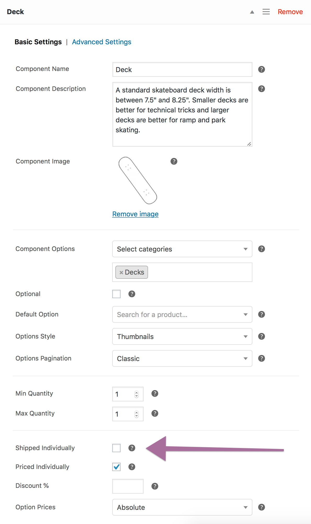
Note that the Shipped Individually option is configurable at Component level only. The extension is not able to handle cases that require some Component Options to be assembled in the Composite (if chosen), and some to be shipped individually.
Notes on External Order Fulfillment, Shipping and Inventory Management Services
The shipping configuration options of the Composite type allow shipping methods and other business logic that relies on the WooCommerce Shipping API to calculate shipping costs accurately.
External fulfillment, shipping and inventory management services work by importing WooCommerce order data. If you rely on an external service provider, you might encounter issues with assembled Composites (this means Shipped Individually is disabled for one or more Components). For example, you may find that the physical properties of imported Composite products are inaccurate, resulting in wrong shipping rate calculations — or that Component SKUs are not imported at all, resulting in inventory issues.
These systems typically rely on the stock keeping units (SKUs) included in WooCommerce orders. Some of these systems do not support fulfilment, shipping, or inventory management of bundles/kits at all. Those that do usually work by splitting up a static or dynamic bundle/kit SKU to a number of component SKUs. This means that, in most cases and depending on the features and requirements of the system you are using, some additional integration work might be needed.
Composite Products provides an API that allows you to restore the physical representation of your Composite products when reading order data, and possibly generate custom kit SKUsfor composites that contain assembled items.
Component Settings
So far, you have learned how to:
- Assign a title to a Component using the Name field.
- Add product options to a Component using the Component Options field.
- Have the price of specific Components added to the price of the Composite by enabling the Priced Individually option.
- Apply a discount on all Component Options using the Discount field.
- Keep the Shipped Individually option disabled for Components that are physically assembled in their container.
In this chapter, you will learn how to make the most of the remaining Component settings, located under the Basic Settings and Advanced Settings tabs.
Basic Settings
Component Name
See Getting Started.
Component Description
Used to provide details about the Component or its configuration. HTML and shortcodes are supported and will be rendered in the front-end.
Component Image
Placeholder image displayed by default in configuration summary sections. When a Component Option is chosen, the placeholder image of the Component is replaced by the image of the chosen product or variation. Summary sections are displayed:
- In the final Review step of the Stepped layout.
- In the Configuration Summary of the Componentized layout.
- In the Composite Products Configuration Summary widget.
Component Options
See Getting Started.
Optional
Component selections are validated and a Composite product cannot be purchased unless all of its Components have a valid selection. Additionally, the Progressive and Stepped layouts – which implement a step-based UI – prevent users from proceeding to the next step unless a valid selection is made in the current one.
When a Component is saved as Optional, it can be skipped without choosing any option.
Default Option
Allows you to choose a product to use as the default, pre-selected Component Option.
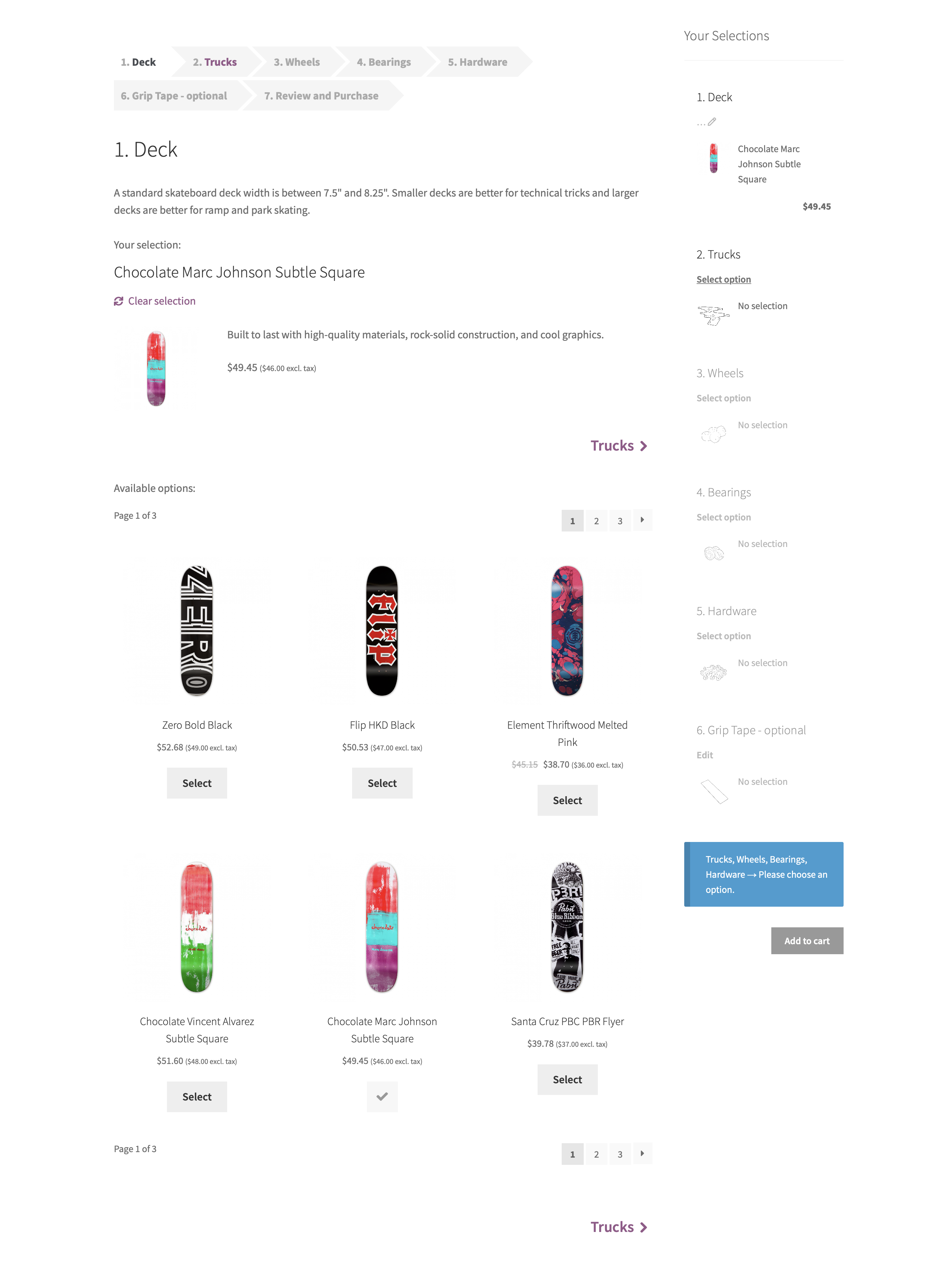
Options Style
Can be used to change the presentation of the Component Options assigned to a Component:
| STYLE | DESCRIPTION |
|---|---|
| Thumbnails | Component Options are displayed as product thumbnails, paginated and arranged in columns similar to the main shop loop.
 |
| Dropdown | Component Options are listed in a drop-down menu. No pagination or lazy-loading functionality is supported. Suitable for displaying up to 10-15 Component Options.
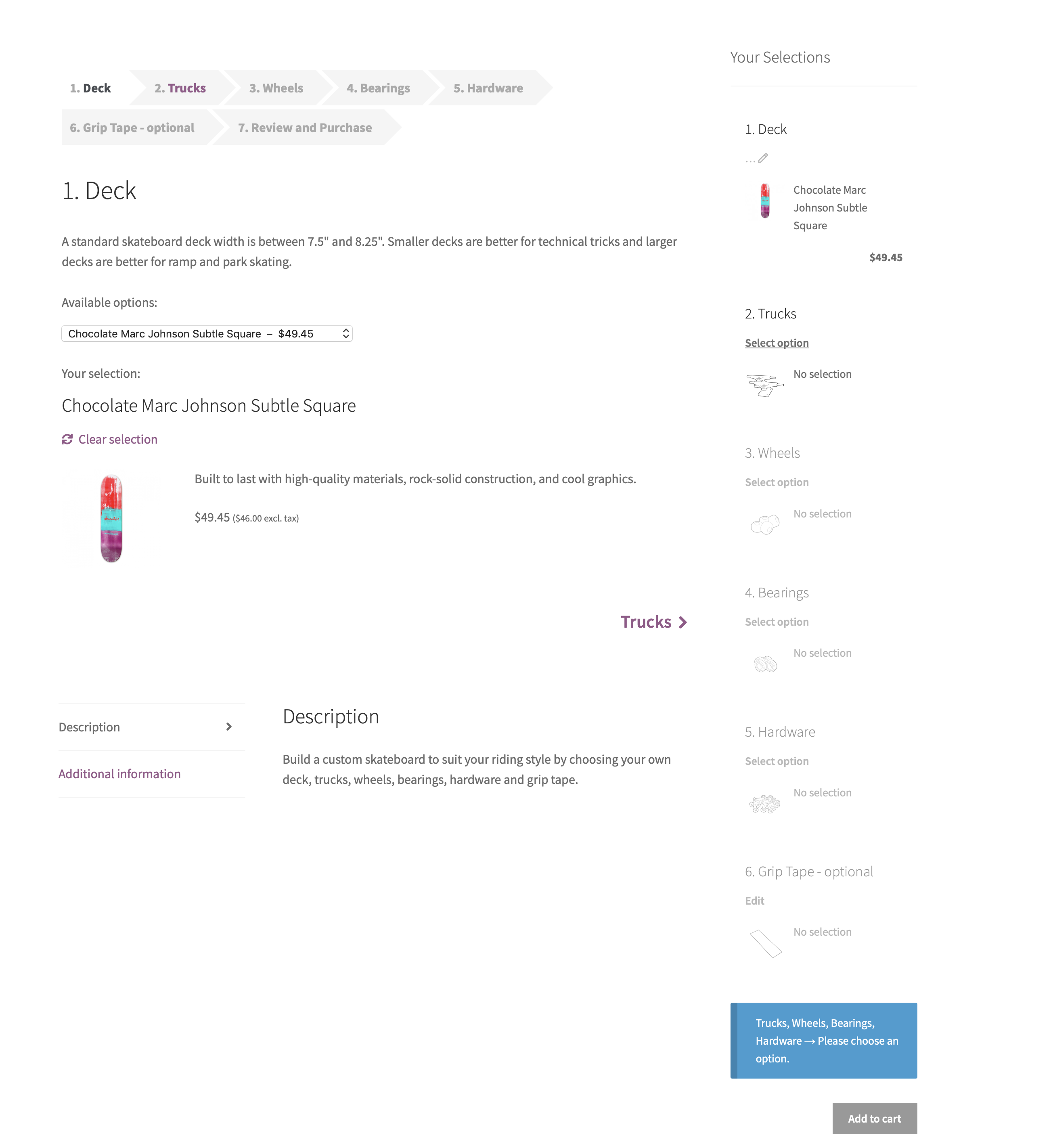 |
| Radio Buttons | Component Options are listed as radio buttons. No pagination or lazy-loading functionality is supported. Suitable for displaying up to 6-7 Component Options.
 |
Options Pagination
Changes the way Component Options are paginated:
Classic — Component Options are arranged in numbered pages, similar to the main shop loop.
Load more — Additional Component Options can be appended by clicking a Load morebutton.
Displayed when Options Style > Thumbnails is chosen and the Stepped or Componentized layout is active.
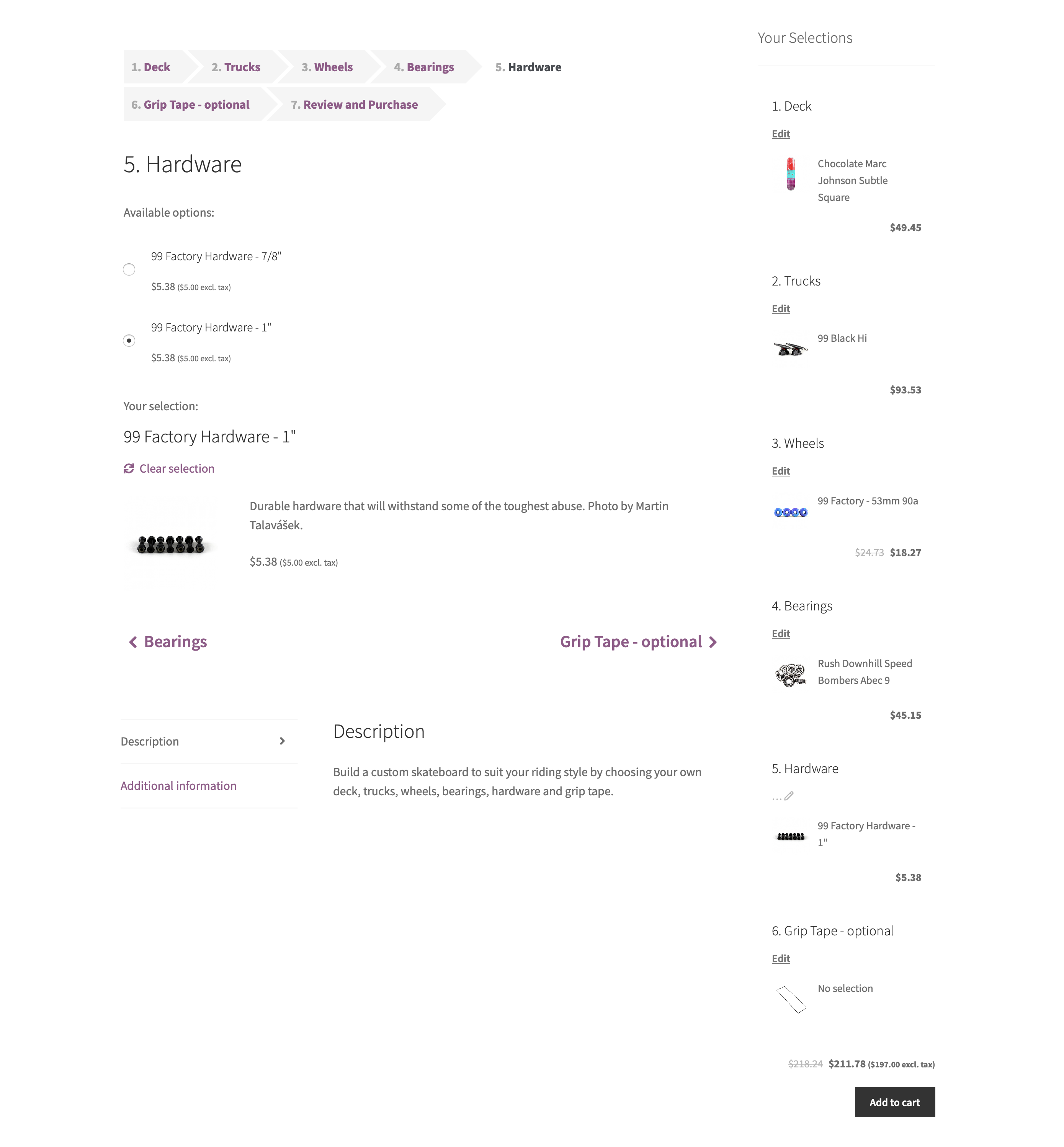
Min/Max Quantity
Can be used to define an allowed quantity range for the selected product.
Shipped Individually
Covered in Shipping.
Priced Individually
Covered in Pricing.
Option Prices
Changes the way Component Option prices are displayed:
Absolute — Product prices are absolute, e.g. $100.
Relative — Product prices are calculated and displayed relative to the price of the active selection, e.g. +$10 or -$20.
Hidden — Product prices are hidden.
Displayed when Priced Individually is enabled.
Advanced Settings
Option Select Action
Controls the behavior of the Composite product after a non-configurable Component Option is chosen in a Component. Available only with the Stepped and Componentized layouts.
View selection details — Display the chosen product details without moving to the next Component.
View next step — View the next Component.
Selection Details Visibility
By default, the product details that appear when choosing a Component Option include its product title, short description, price (when the Priced Individually option is enabled) and possibly additional configuration fields associated with the chosen product, such as variation attribute drop-downs and/or Product Add-Ons.
Title — Controls the visibility of the product title.
Description — Controls the visibility of the product short description.
Thumbnail — Controls the visibility of the product thumbnail.
Price — Controls the visibility of the product price.
Product Add-Ons – Use this option to disable all Product Add-Ons of the selected product. Applicable when the Product Add-Ons extension is installed.
Subtotal Visibility
Controls the visibility of Component Option subtotals in the single-product page, cart/checkout templates, and order-details/e-mail templates.
Options Sorting
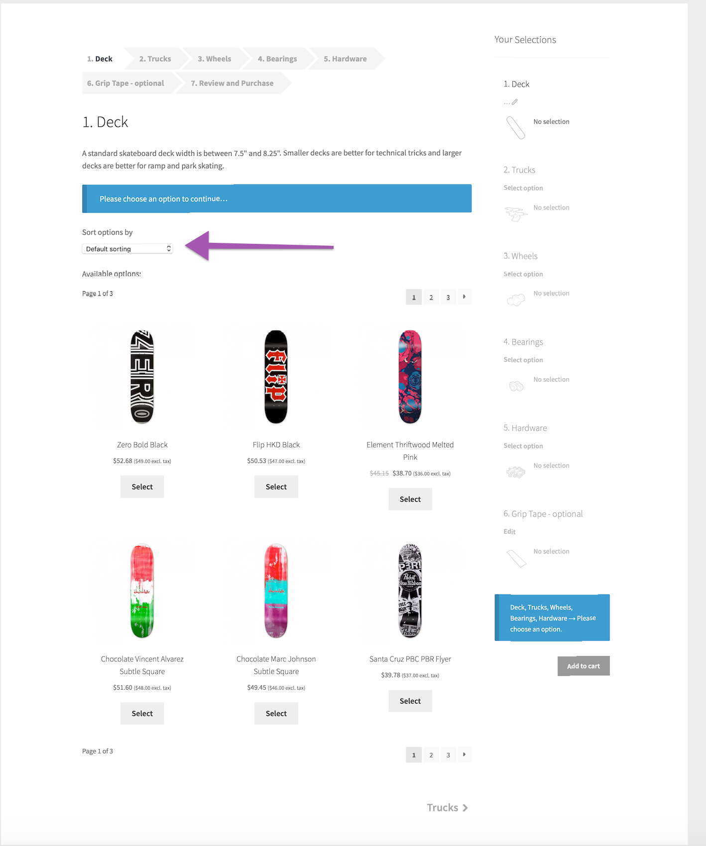
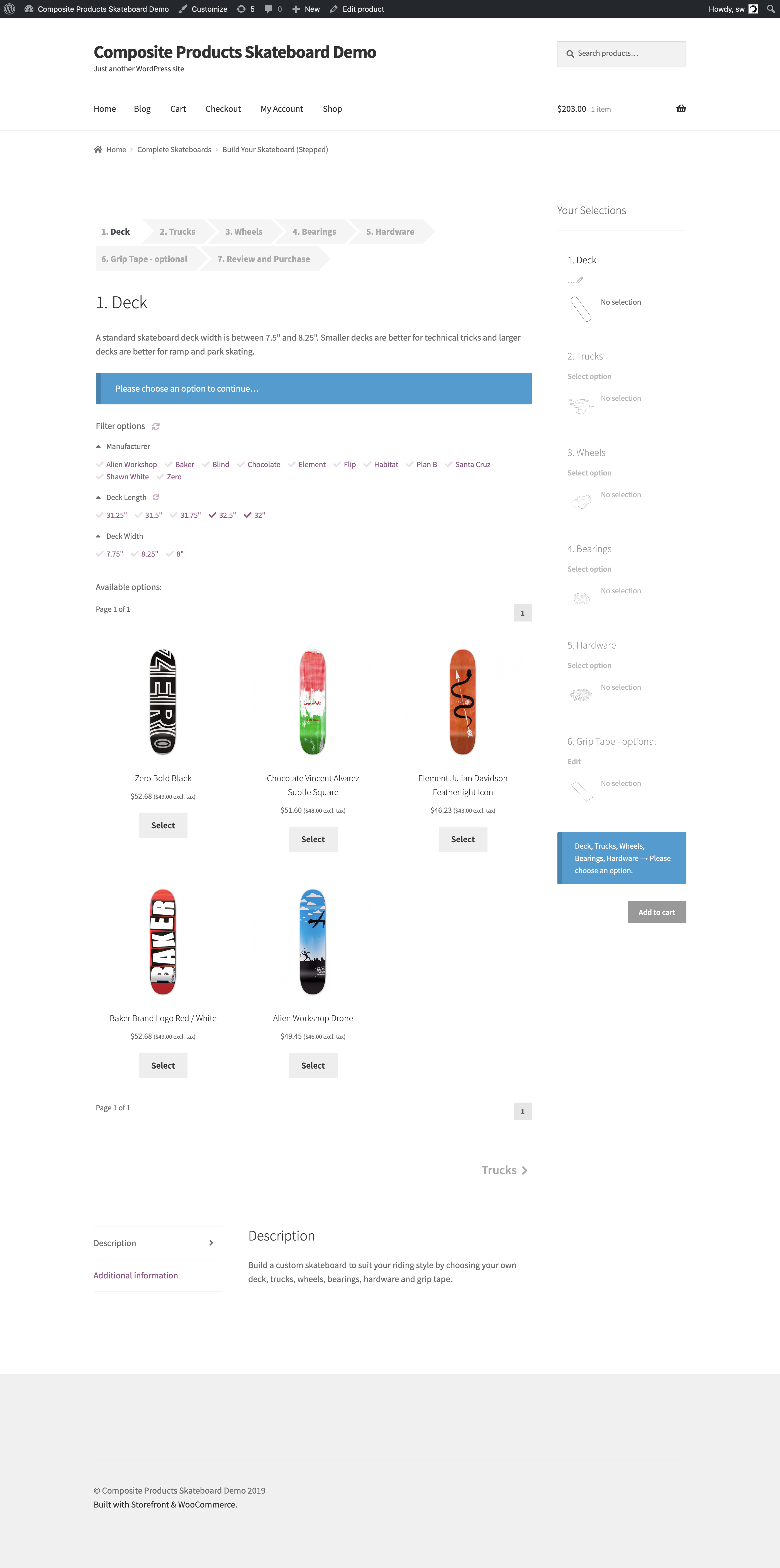
Toggles the display of a “Sort options by” dropdown, which can be used to sort Component Options by popularity, rating, newness or price.
Options Filtering
Toggles the display of layered attribute filters, which can be used to narrow down Component Options based on specific product attributes.
Layout Options
The extension covers a wide range of kitting applications that range from small, static bundles to complex product kit builders that may include thousands of Component Options.
Once the contents of a Composite product are defined, the next step is to adjust its layout. The layout of a Composite product can be adjusted by configuring the following options:
- Layout, found at the top of the Components tab.
- Form Location, found at the top of the Components tab.
- Options Style, found under the Basic Settings tab of each Component.
- The Composite Product Summary widget, which can be activated from the Appearance > Widgets menu.
Additionally, you can:
- Enable sorting and filtering controls for specific Components.
- Define a default, pre-selected option for each Component.
Layout
The Layout field allows you to modify the way Components are laid out on the screen. Four layout options are provided:
- Stacked
- Progressive
- Stepped
- Componentized
The following table summarizes their differences in detail.
| LAYOUT | DESCRIPTION |
|---|---|
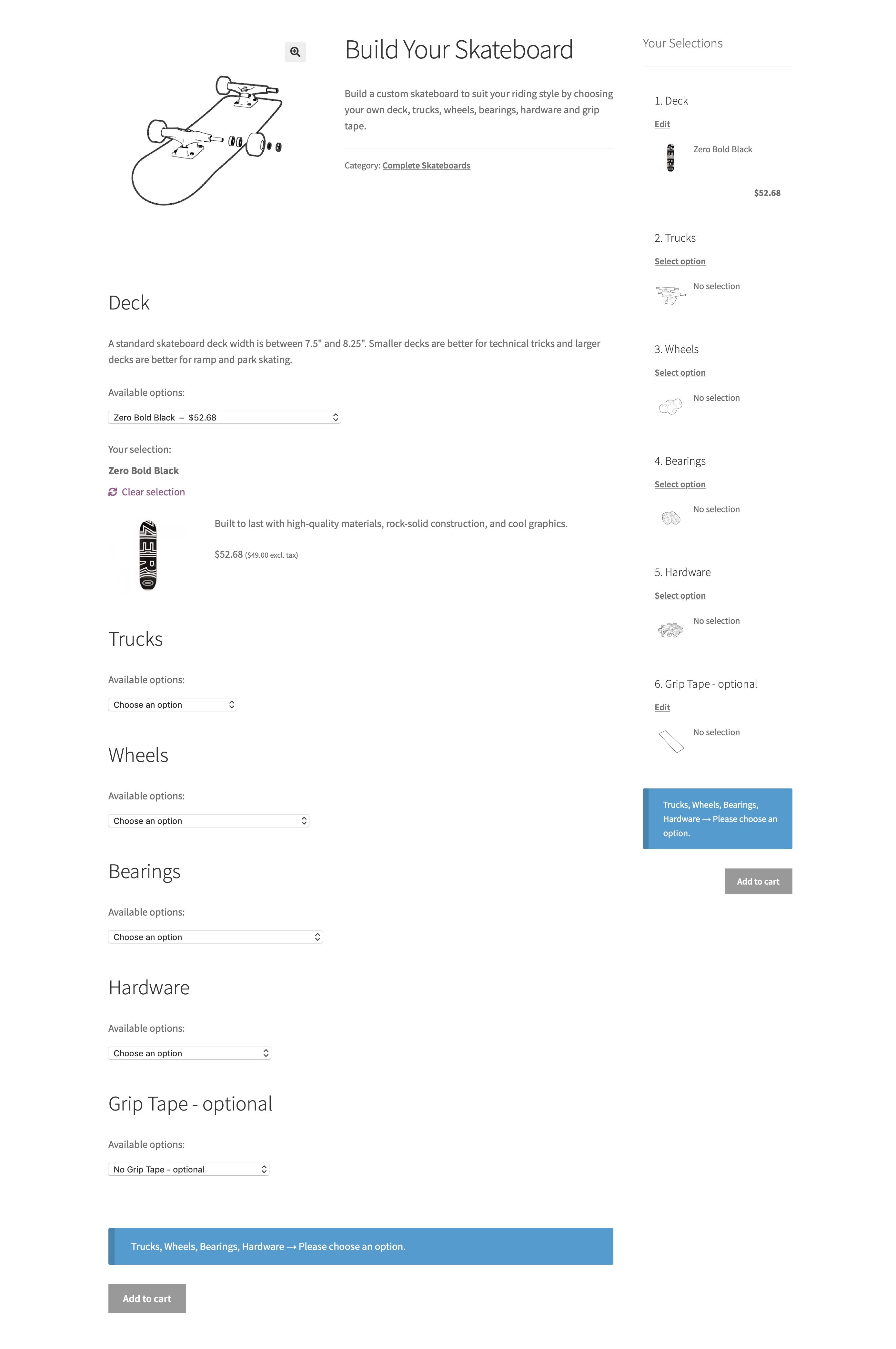
| Stacked | Components are vertically stacked. The add-to-cart button is placed at the bottom.The Stacked layout is recommended if the Components of your product kit contain a few options, or if you want to keep the configuration process quick and simple.
 |
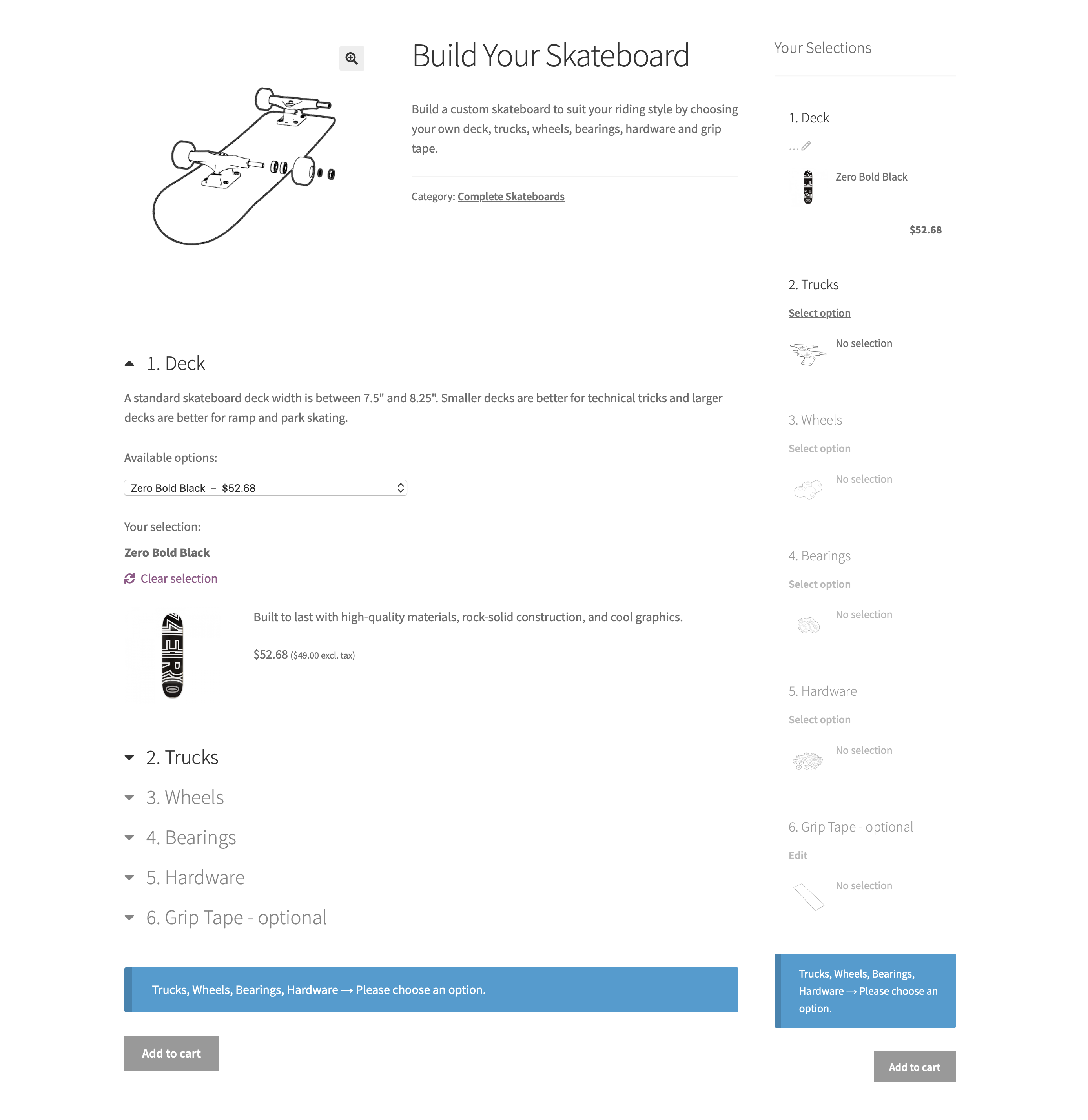
| Progressive | Similar to the Stacked layout, with 3 key differences:
Using Toggle-boxes with the Stacked layoutToggle-boxes can be enabled with the Stacked layout by using this snippet.
 |
| Stepped | Components are presented and configured individually and in sequence, in a step-by-step manner. The chosen options are summarized in a final Review step, at which point the Composite product can be added to the cart.The Stepped layout is recommended for kitting applications that involve Components with long, complex contents.
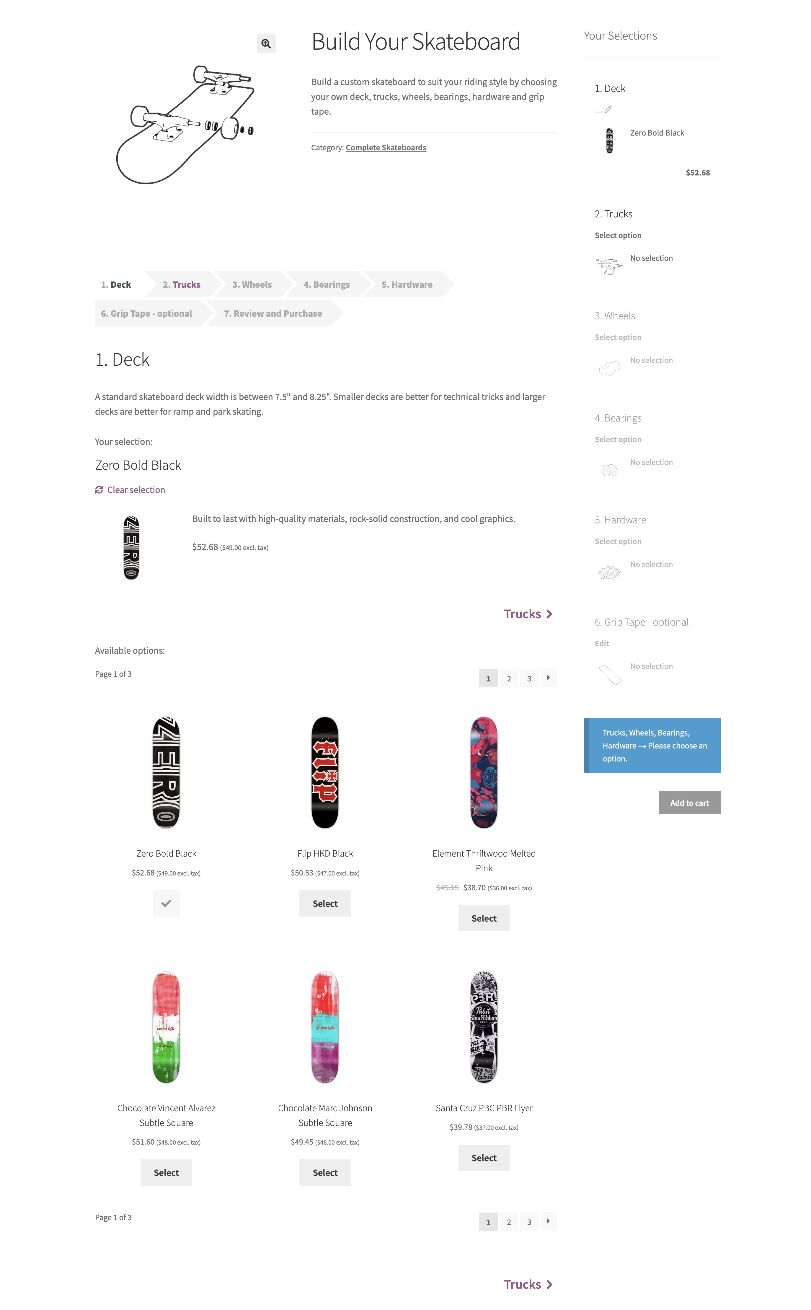 |
| Componentized | Components are presented and configured individually, but not necessarily in sequence. A key element of the Componentized layout is the Summary section, which provides an overview of all Components and lists the chosen options. To configure a Component, the Summary section is temporarily hidden from view. The final configuration can be added to the cart by returning to the Summary.The Componentized layout is also recommended for kitting applications that involve Components with long, complex contents.
By default, the Componentized layout does not require Components to be configured in sequence. This can be changed by activating this snippet.
  |
Rules of Thumb
Configuring a Composite product should be easy and painless – the entire process must keep customers involved and guide them quickly from start to finish. Here are a few rules of thumb for optimizing the customer’s experience:
- Choose the Thumbnails style when you want to display images of the available Component Options, or when offering a large number of options. The Thumbnails style makes Component Options look similar to your WooCommerce shop archives and provides the ability to sort and filter products by attribute – useful for narrowing down results quickly.
- When dealing with multiple Components that include rich content – such as long descriptions and product images – consider breaking up the configuration process in individual steps. Avoid choosing the Stacked layout and experiment with the Progressive, Stepped and Componentized layouts.
In contrast:
- Thumbnail previews are not always necessary. Use the Dropdown or Radio Buttons style when necessary: drop-down menus are great space-savers, while radio buttons provide a better overview of the available options.
- The Stacked layout is ideal if you want to make it easy and quick for customers to customize and purchase a Composite product. When using it, keep an eye on form length – endless pages are confusing and prone to abandonment.
Form Location
Most WooCommerce-compatible WordPress themes default to a two-column product page layout: The first column contains the main product image and gallery, while the second one is reserved for product details and options. This space-conserving approach works well for Simple and Variable products, which usually contain only a few form elements.
Composite products tend to have busier forms that require multiple steps/interactions to complete. Sometimes you may find that your theme’s two-column layout makes Composite products look space-constrained and hard to interact with. Some themes may allow you to modify the layout of individual product pages to display product details and options in a single column. For example, if you are using Storefront, the Storefront Powerpack plugin includes options for:
- allocating more width to product form content, or
- stacking product form content below the main product image and gallery.
If you are experiencing layout issues and your theme does not provide any per-product layout options:
- Navigate to Product Data > Components.
- Locate the Form Location option.
- Choose Before Tabs to stack form content before the product tabs.
In most cases, choosing Before Tabs will allocate the entire page width to the form contents of your Composite.
Configuration Summary Widget
The Composite Product Summary widget can be added to any widgetized area from the Appearance > Widgets menu and is only displayed when viewing single-product pages of the Composite type. It provides:
- Dynamically updated configuration details for all Components, including subtotals.
- Navigation functionality – click on a Component in the widget and you’ll be taken there.
- Quick access to validation messages and the add-to-cart button.
The widget can be seen in all examples provided in the Layout Options section.
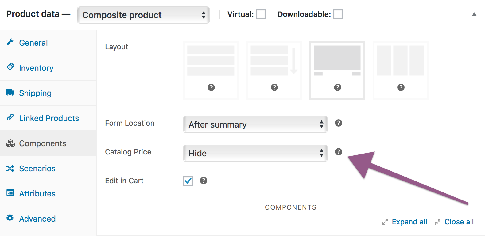
Catalog Price
The Catalog Price option changes the way Composite product prices are calculated and displayed in shop archives and single-product page summaries:
Use defaults — Displays the price of the default Composite product configuration. When Use defaults is selected, a Default Option must be set in all non-optional Components.
Calculate from/to — Builds a price string based on the configuration with the lowest price.
Hide — Hides the price.
Cart Editing
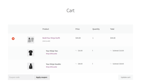
Configurable Composite products like this Custom Skateboard can be edited from the cart page by enabling the Edit in Cart option.
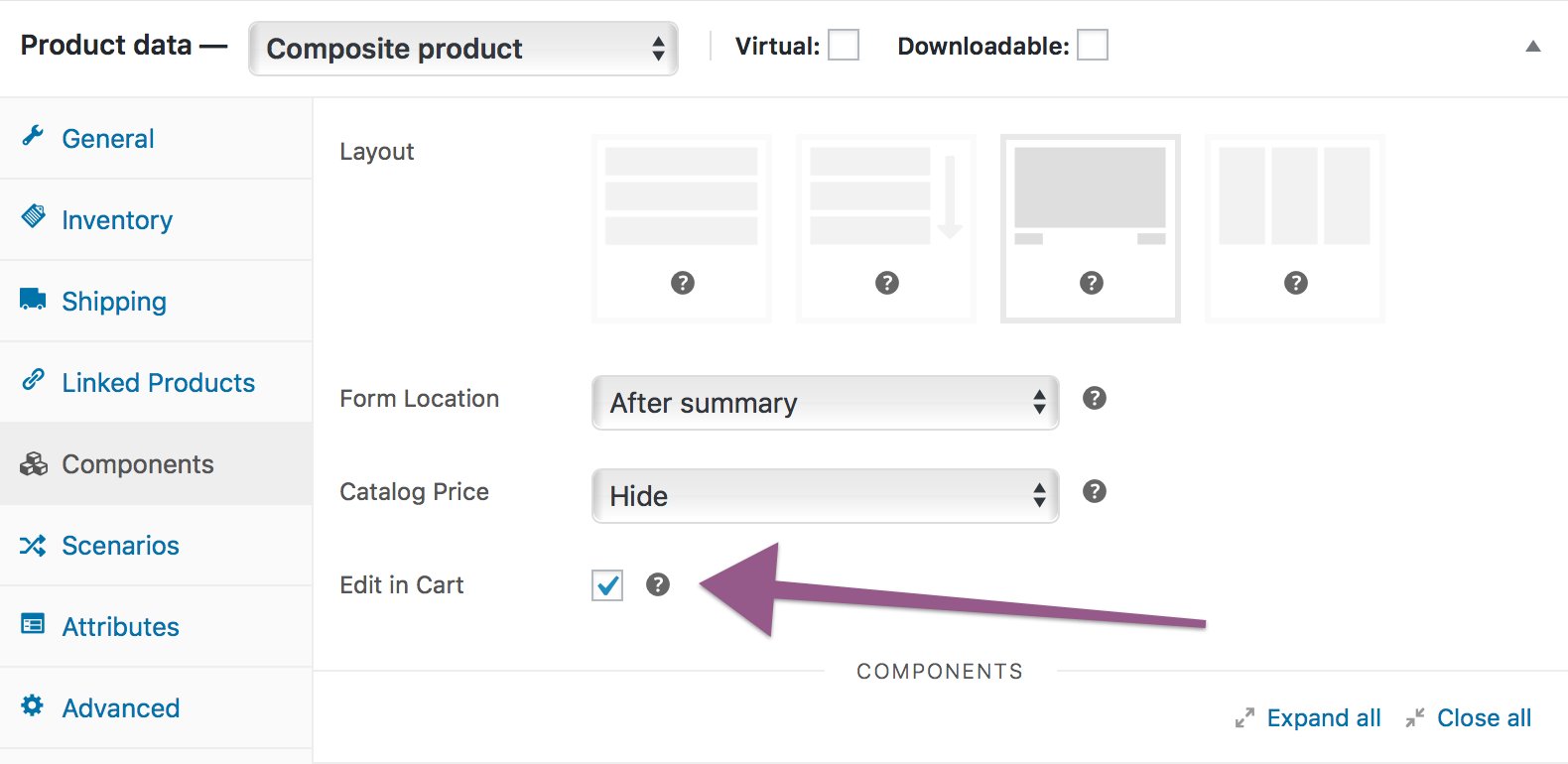
When Edit in Cart is enabled for the Custom Skateboard Composite, an additional “Edit” link is appended to its title in the cart. Following this link allows you to reconfigure the Composite using its current configuration as a starting point. When finished, click Update Cart to replacethe configuration in your cart with the new one.
Managing Inventory
The sale of a product in a Composite has the same effect on its stock as an individual sale. When configuring a Composite product, if the available stock quantity of a chosen product is below the minimum threshold required by the Component it belongs to, then the Composite appears with an Insufficient Stock status and cannot be purchased.
With Composite Products, it’s possible to define composite SKUs and manage inventory for composite SKUs. The ability to set stock quantities for composite SKUs allows you to place constraints on the bundling process itself, e.g. associated with time, manpower or another limited resource. Go to the Inventory settings tab of a Composite product to enable stock management and set stock quantities at composite level. Note that when stock management at Composite level is enabled, the inventory of products used as Component Options is not overridden or affected in any way.
Use Cases
The following use cases are useful for gaining a better understanding of what is possible with Composite Products:
- Creating Configurable Products – A DSLR Camera kit.
- Creating Step-by-step Kit Builders – A Custom Skateboard builder.
- Selling Products in Bulk – The Poster Pack composite.